I encountered an article titled Owen Jones and the Left’s Fantasy economics. It seems that Owen Jones really gets under the skin of some on the right, which makes me think that at least some of what he says must have merit or they’d just ignore him. The article was based on a report from the Office of National Statistics that looked at the change in real wages since 1986.
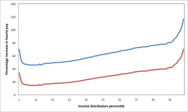
The article is factually correct, in the sense that it correctly presents the results of the report. Most of what the article says is based on the figure below. Basically, the ONS report looked at hourly wages in 1986, adjusted them for inflation, and then compared them with hourly wages in 2011. The result is that, in 2011, every income band has seen a significant percentage increase in hourly wage. The conclusion is, therefore, that everyone is better off (compared to what they were in 1986) and the Left should stop complaining and should really start analysing and interpreting the data properly. There are, however, a number of issues with this interpretation.

Firstly, it’s clear that the top earners have seen a bigger percentage increase than the bottom (apart from the bottom few percent). This is consistent with numerous other indicators (Gini, 90/10 ratio) that show that the UK has become more unequal over the last few decades. What’s more, the figure somewhat under-represents the change as a big shift happened around – and just before – 1986 (see an earlier post). The interpretation in the article is that poverty is absolute not relative, so as long as everyone’s salary increases relative to inflation, everything’s fine. There may, in a sense, be some merit to this. One could imagine a society that was very unequal, but in which everyone could afford the basics and, to some extent (compared some other parts of the world) this is true of the UK, but it certainly appears to be getting harder for those on low incomes to cope. Also, the Poverty Site suggests that, today, the top 50% of earners take more than 75% of all the income. Imagine this continued to increase to the, admittedly, extreme case of the top 50% taking more than 90% of all the income. It’s hard to imagine that any industry would bother catering for the bottom 50% of earners. They would only be taking home 5% of all the income, so what’s the point. I can’t see how, in such an extreme situation, poverty would not be relative, despite what any indicators may imply.
The above is, in some sense, my opinion and I can’t really think of a good way to quantify the impact of increasing inequality (although Kate Pickett and Richard Wilkinson make some convincing arguments in their book “The Spirit Level”). There are, however, some fairly straightforward criticisms of the article. The report used the Consumer Price Index (CPI) when determining how to correct for inflation. CPI does not include housing costs. The Retail Price Index (RPI), however, does and is typically about 1% higher than CPI. I downloaded the data from the report and recalculated the changes based on RPI, rather than CPI, assuming the average RPI was 1% higher than the average CPI used to determine the figure shown above. The resulting figure is below, with the blue line showing the original data and the red line showing my new data. This shows that, including housing costs, the increase is less significant than initially indicated.
The other issue I have is that it only considered full-time employees. I’m yet to find a decent definition of full-time employment but there appears to be a large number of people in the UK who are underemployed. They are working fewer hours than they would like and presumably are not included in this report. I always feel that annual income is more of an indicator than hourly wage. The report is, therefore, presumably underestimating the increase in wages for those on low incomes (since it is ignoring all those who have been, and who currently are, underemployed).
There was one final thing about the article that somewhat irritated me. It referred to a report by the Resolution Foundation called Low Pay Britain. What the article referred to was that, according to the Resolution Foundation, only 3.8% of workers in the UK earn below the minimum wage. What it failed to mention was that a further 20% earn below what is regarded as a Living Wage. One could debate what the living wage actually should be, but it seems that many people in the UK are on salaries that make it difficult to live. Maybe in some absolute sense they can still survive, but it seems clear that inequality has increased in the last few decades and I would still like to hear a solid argument for why our society is benefiting from this increasing inequality.
